SaaSPropTechDesign Systems2023 → present8 min read
A component kit is not a design system
WinConnect is the system twelve WIN products are built on. I didn't draw its components — I chose the foundation, themed it into ours, drew the rules for changing it, and have run it alone since late 2023.
12
PRODUCTS
shipped on one shared library
1
DESIGNER
no design team behind the system
3 years
MAINTAINED
of publishing, auditing, and saying no
Scope and tenure — the things that can be counted. Adoption was never baselined before the system existed, so it is argued in the fifth section rather than asserted as a number here.
THE SITUATION
One designer, twelve products coming
Nobody asked for a design system.
When I proposed one, WIN had a single thing to show for itself: a marketing website. The ecosystem was a plan — a CRM, an inspection report writer, a learning system, an admin console, an SME toolkit, and more behind them. There was one designer for all of it.
That is an awkward moment to make the argument. There is no drift to point at, no audit to run, no two teams disagreeing in a review. You are describing a problem that products which do not exist yet have not had yet.
It is also the only moment the argument is cheap. The cheapest time to agree what a button is, is before anybody has shipped one.
THE DECISION
I bought the vocabulary
I licensed the foundation rather than drawing it: Minimal, a commercial MUI-based admin system, with a Figma library and a React implementation that already matched each other. The evaluation took an afternoon. It bought back months I did not have, and it is the decision in this project I am most often asked to defend.
The defence is that a component library is a solved problem and a design system is not. Nobody is going to hire WIN because its date picker was drawn in-house. What was going to decide whether twelve products held together was everything around the components — and that part cannot be licensed, because it is specific to how one organisation actually works.
Buying is a design decision, not a shortcut.
I evaluated foundations the way I would evaluate any dependency the next three years would be built on. The last row is the one most people skip, and it is the one that came true.
| WHAT I EVALUATED | WHY IT DECIDED THE CHOICE |
|---|---|
| Coverage of the boring parts | Upload, rich text, org chart, product walkthroughs — the components every product rebuilds badly and nobody volunteers to own |
| A coded counterpart | A Figma library with no React behind it moves the drawing work, not the building work |
| Token structure already in place | Primitives, semantics and component tokens — something to draw a permission model on top of, rather than invent underneath |
| Theming depth | Two modes and a settable primary, so twelve products could differ without any of them forking the library |
| What it locked in | The component API is MUI's. Anything MUI does badly, WIN inherits — and in a couple of places we have |
WHERE THIS STARTED
A bought kit is the bottom rung, and I knew which rung I was on
Every maturity model in this field agrees about the bottom of the ladder: one file of components is a UI kit, and that is all it is. What lifts a kit into a system is the part that has owners — tokens with rules attached, documentation somebody maintains, a code counterpart that stays in step, and products that actually consume it.
The licence bought rung one on the afternoon I bought it. Everything in the sections after this one is the climb, and the climb is the part that took three years.
THEMING
Theming is a surface, not a setting
A licensed foundation arrives wearing somebody else's brand, and the temptation is to treat re-theming as a find-and-replace on one colour. It is the first place a bought system gives itself away, so it is where I started.
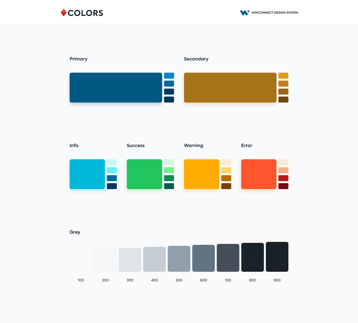
Light and dark are the same variable names holding different tables: background/default goes from #ffffff to #141a21, background/paper from #ffffff to #1c252e, text-primary from #1c252e to #ffffff, and the shadow colour from a cool grey to black — because a grey shadow on a dark page is not a shadow. Nothing is renamed, nothing is conditional, and no component knows which mode it is in.
One token I deliberately held still: primary/main is #005982 in both modes. A product's identity should not change when the lights go out, and making the brand colour mode-dependent is the shortcut that quietly produces two brands.
On top of that sit the two axes a product actually gets to pick — whether the navigation reads as part of the page or as a panel over it, and which primary it takes. Those combinations are why a CRM and an inspection report writer can feel like different products while sharing every component between them. The specimen below is that mechanism, running: move across it to change the primary, down it to cross the modes.
ARCHITECTURE
The tier boundary is the permission model
Three layers came with the foundation. A primitive is a fact about the palette: grey/500 is #919eab, spacing-2 is 16, radius-1 is 8. A semantic token is a decision about meaning: text-secondary, background/paper, primary/main. A component token is a decision about one part: nav/vertical/item-root-height is 44, card/radius is 16.
What did not come with it was a rule about who may edit which. That rule is the part I added, and it is the part that has done the most work.
Product teams theme at the semantic layer and nowhere else. Editing a primitive is a palette change and has to be argued for. Editing a component token is a redesign of that component in twelve products at once, which is a conversation, not a keystroke.
shadow/card
- shadow/12% #919eab1f · 0 12 24 −4
- shadow/20% #919eab33 · 0 0 2 0
Two effects, eight primitives, one name. The dark mode swaps only the two colours — the geometry is shared.
h1
- h1/size 64 · h1/line-height 80
- h1/weight 800 · h1/letter-spacing 0
The type styles hold no numbers of their own. Every one of them is assembled from four variables, which is what makes a scale change a single edit instead of eleven.
ADOPTION
Twelve products, one shell
The products have very little in common as products. A CRM is dense, relational and lives in tables. An inspection report writer is a long linear form that people fill in on site, often on a phone, often in bad light. A learning system is mostly reading. An admin console is mostly destructive actions that need to be hard to do by accident. The SME toolkit is somebody's first ten minutes with the ecosystem.
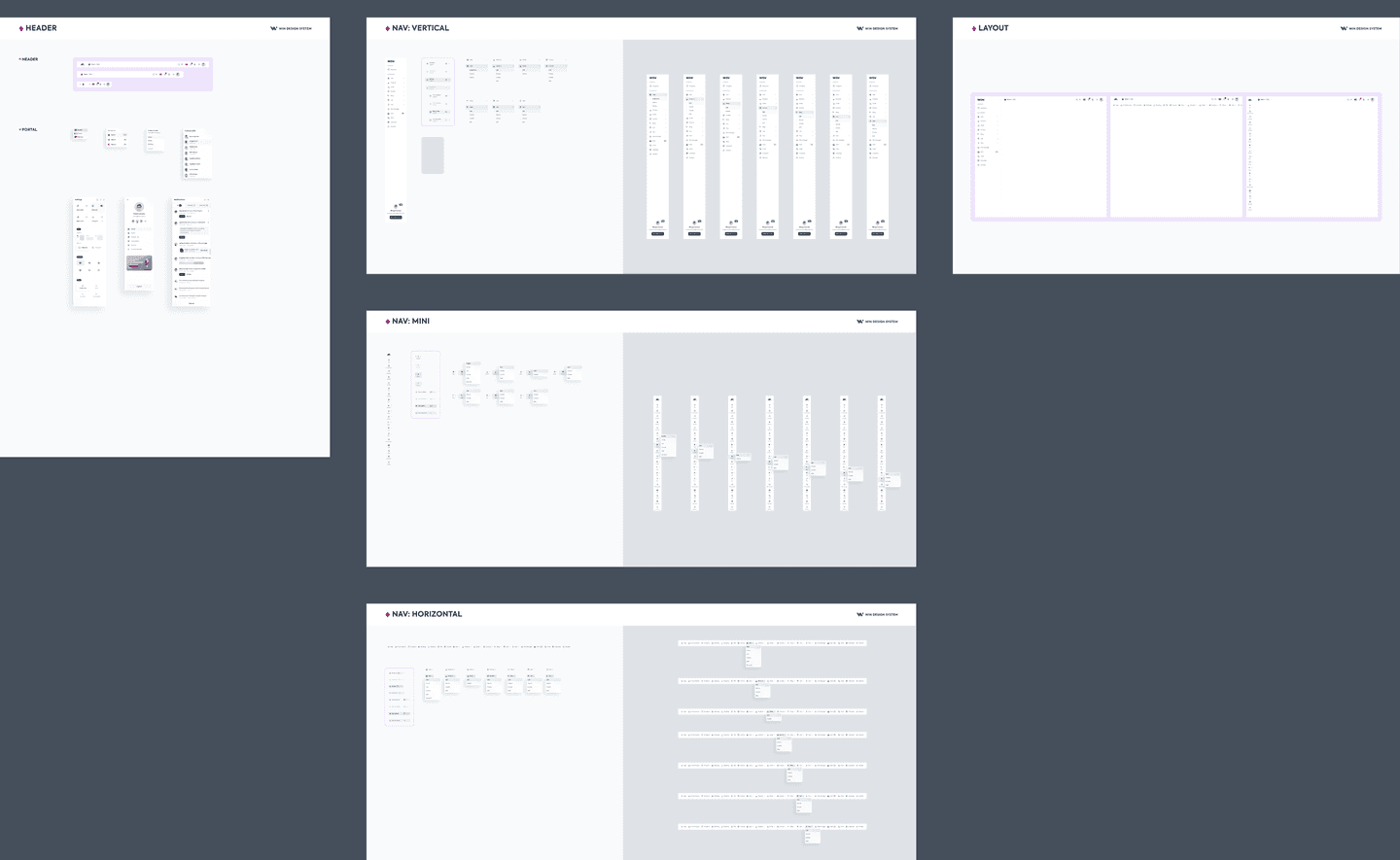
What they share is not a look. It is the shell — where navigation lives, how deep it nests, what a page header contains, where a settings panel comes from, what a destructive confirmation reads like — plus the tier boundary that says which of those a product may argue with. That is the part that had to be decided once. The rest is each product's own problem, and should be.
Two products, the same parts.
The most useful test of a shared system is not whether two products look alike. It is whether two products that should not look alike can still be built from the same box.
MAINTENANCE
A system nobody maintains is a screenshot
The afternoon in the second section is the whole of the buying. The three years since are the system, and they are the half of this project I would point at first.
The model is centralised, and the centre is one person. That is not a best practice so much as an accurate description: every request, every publish and every audit came through me. It is the cheapest governance a twelve-product ecosystem can run on and the most fragile, and both halves of that are true at the same time.
Every change goes out as a library publish with written release notes, and consuming files choose when to take it. That is a small mechanic with a large consequence: no product has ever been redesigned out from under a designer mid-sprint, which is the fastest way there is to make a team detach from a library and never reattach.
Teams could ask for a component, and most of that work was deciding which requests should not become one. The test I used was whether more than one product needed the thing, and needed it for the same reason. A card only the CRM wants is a CRM component and belongs in the CRM's own file; admitting it to the library makes eleven other products carry it.
And I audited. Periodically I went through shipped products against the library looking for divergence, which is the only way to find out whether a system is being used or merely installed.
A request becomes a component, or it doesn’t
A product asksfor a component
Do two products need it,for the same reason?
Designed intothe library
Stays in that product'sown file
Published, withrelease notes
Each product takes itwhen it chooses
I audit shipped productsagainst the library
WHAT THE AUDITS ACTUALLY FOUND
Not every divergence was a mistake
More than once a product had solved something better locally than the library had solved it centrally. The right move there was to promote their version into the system, not to pull them back to mine.
A library that only ever corrects the products it serves stops being read as a resource and starts being read as a rule, and teams route around rules.
THE SEAM
The library is not the product
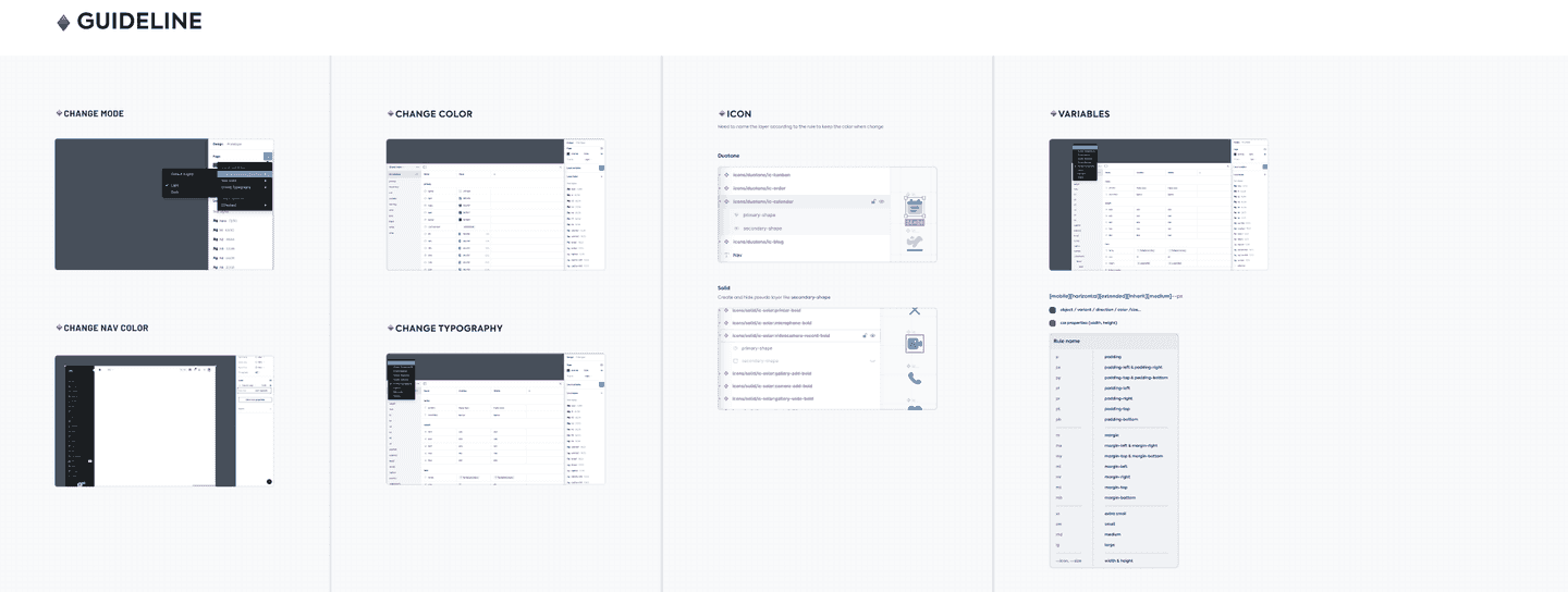
The coded counterpart is a React component library. It is not generated from the design file, and a token I change does not reach production on its own — someone has to carry it across.
That seam is the honest limit of this system, and I would rather name it than let a three-tier token architecture imply an automation that does not exist.
IN HINDSIGHT
The tier I would draw differently
The component-token tier went too deep. I would draw that line higher now.
nav/vertical/item-root-height is 44. That is a real value and it is the right value, and treating it as a governed token was still a mistake of degree. A token that specific stops being a shared decision and becomes a lock: it does not say what the navigation should feel like, it fixes what the navigation is, and a product with a genuine reason to differ has to come to me instead of to the semantic layer.
The tier that earns its keep is the middle one. I leaned on the third because the second was working — which is the ordinary way a system gets over-built. Success at one level of abstraction reads, from the inside, like an argument for another one.
The other cost is the one the second section named in advance. Buying the foundation bought MUI's component API along with it, and where MUI is opinionated in a way that does not suit an inspector standing on a roof in the sun, WIN inherits the opinion. I would make the same trade again — months of runway against a handful of inherited defaults is not a close call — but it is a trade, and a study that only listed what buying gave me would be selling something.
THE COST NOBODY BUDGETS FOR
A system with one maintainer has a bus factor of one
Three years of being the only person who can publish is the number at the top of this page and the largest risk in the project, and it would be dishonest to state the first without the second.
The fix is not more process. It is a second person with publish rights and a reason to care. The honest reason there has never been one is that a single maintainer does not feel like a bottleneck until they leave.

After this study
Other case studies
Capturing 200+ Inspection Photos
Cut reporting time by 13 minutes per inspection, across 20,000+ properties daily
Leave a like/comment, or have a look at my other projects!
—comments